
ui | ux | re-branding
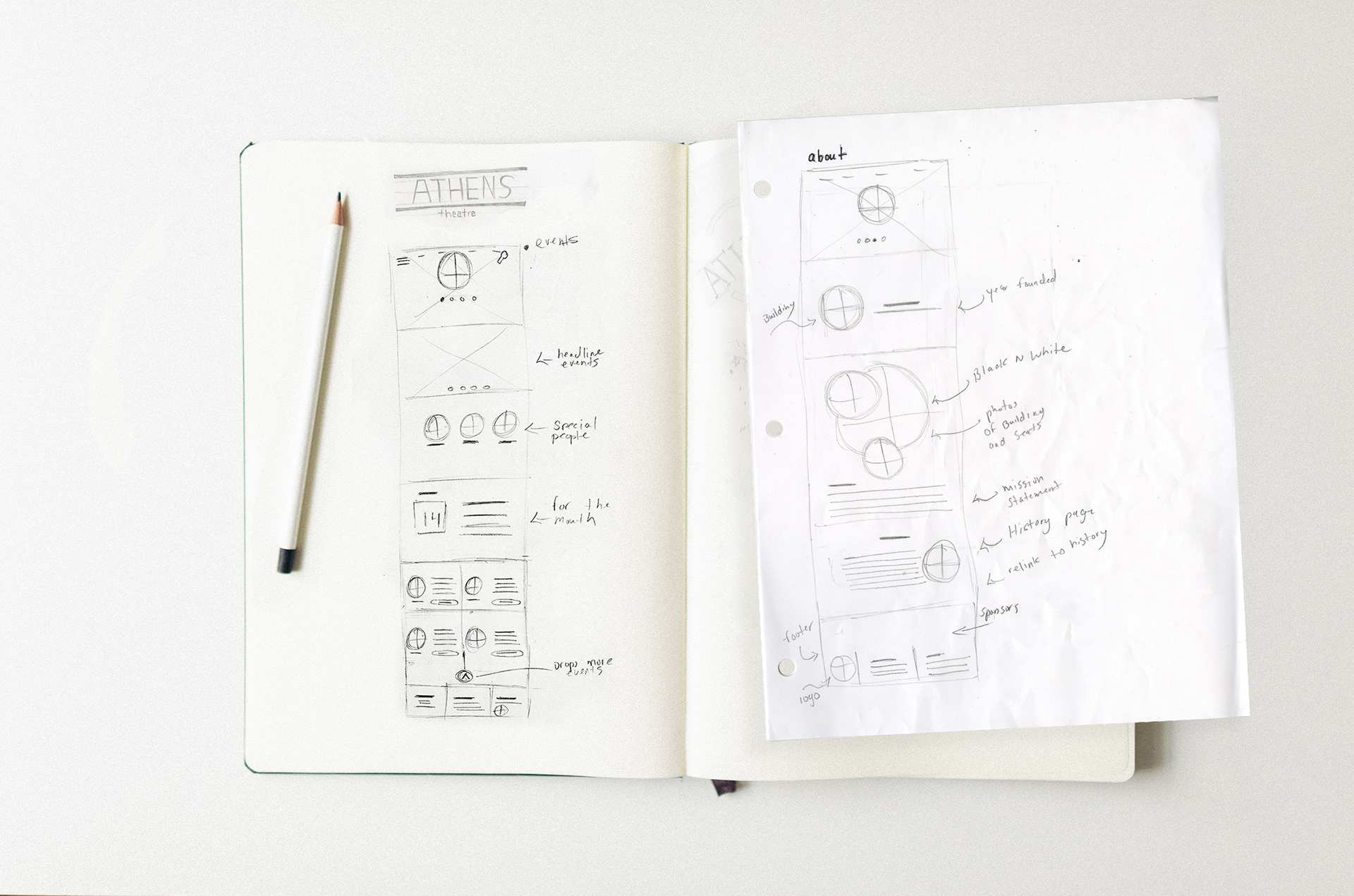
Pen To Paper Wireframes
I wanted to keep my ideas for the website clean and minimalist. While keeping the user journey simple with minimal clicking.
I utilized hierarchy to draw the user to clickable objects.
I utilized hierarchy to draw the user to clickable objects.
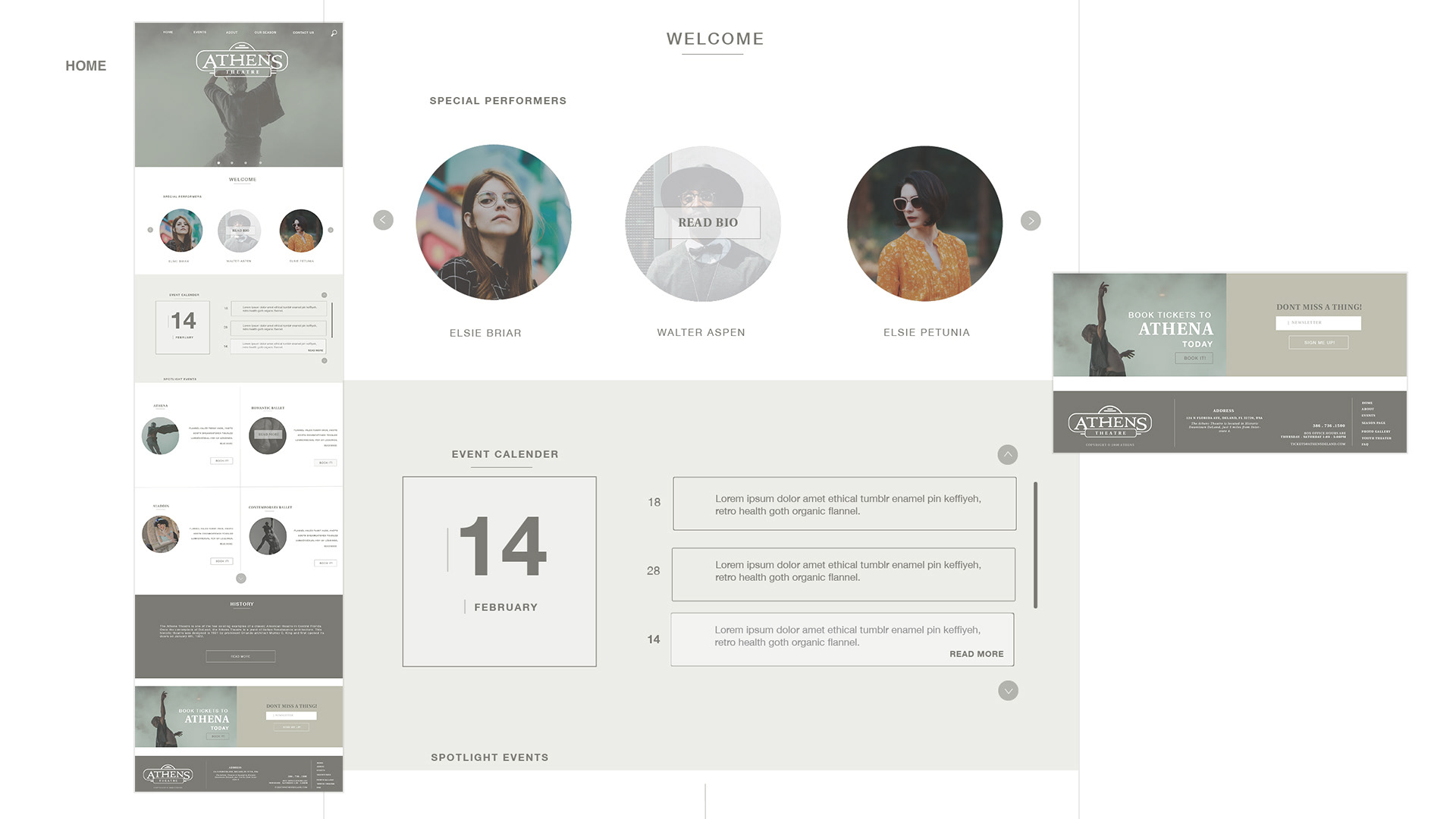
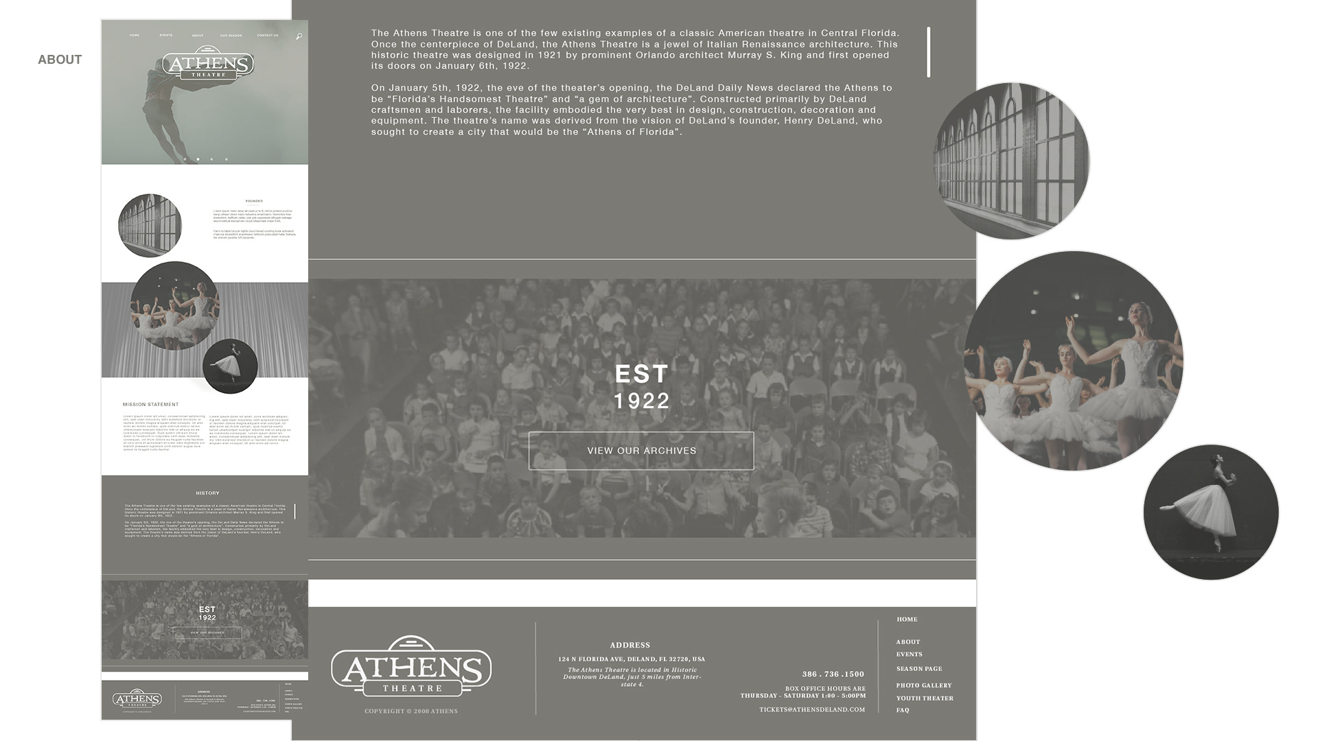
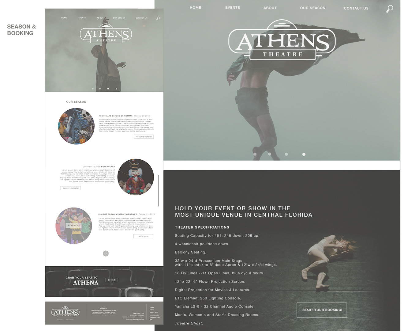
COMPS
Basic comps to show the websites functionality. While making sure to highlight clickable components within the website. I wanted to keep my design clean and simple while still being user friendly to my targeted audience.
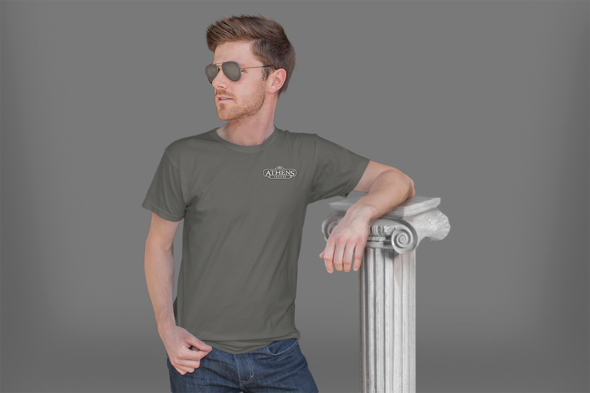
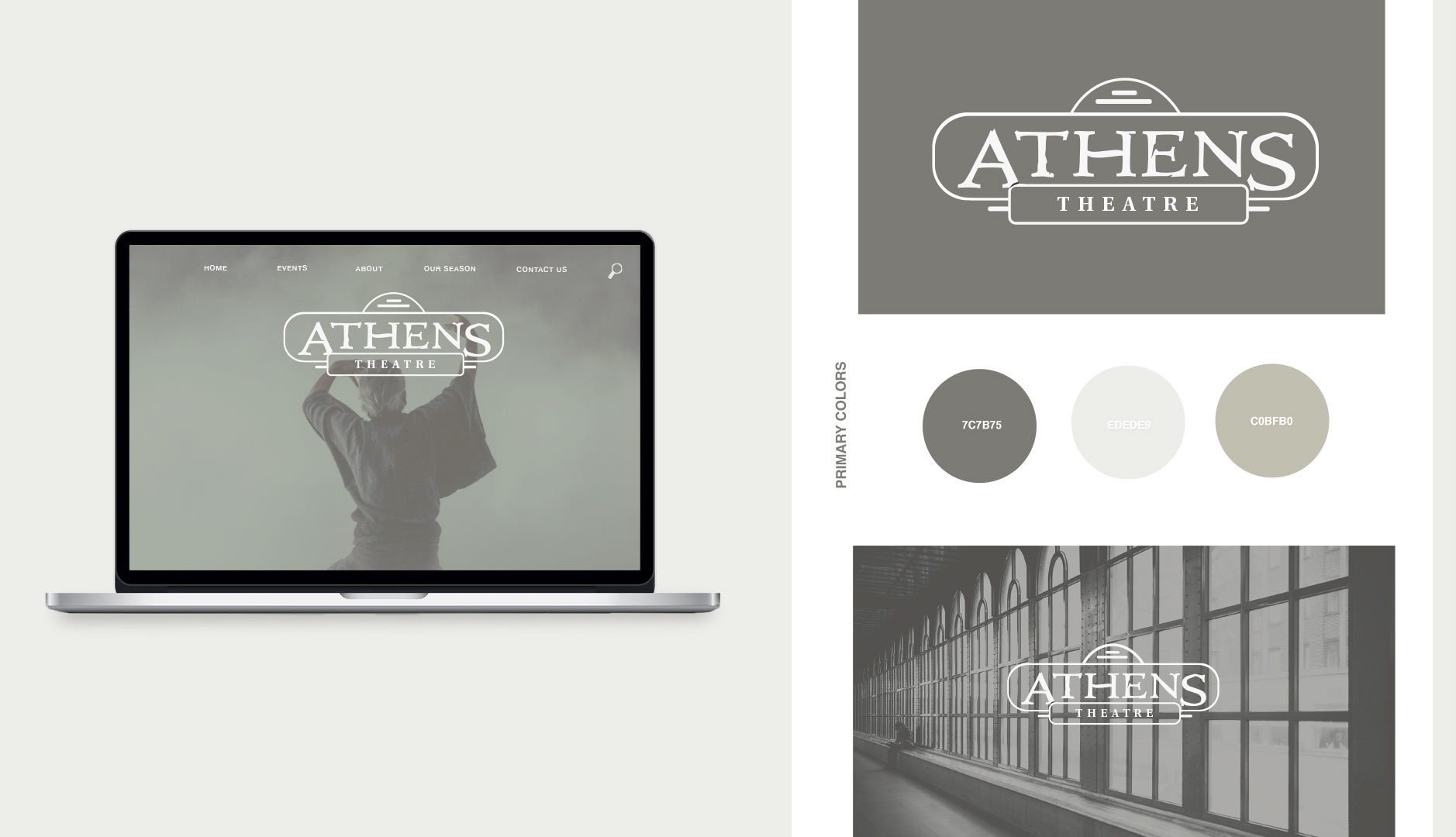
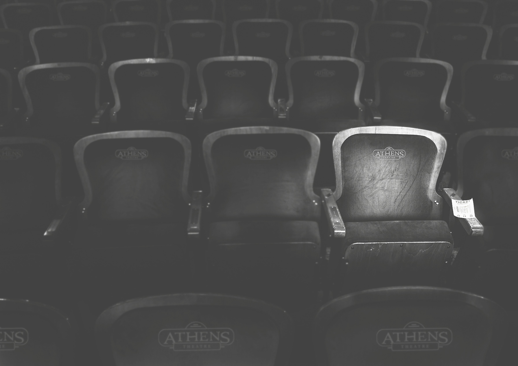
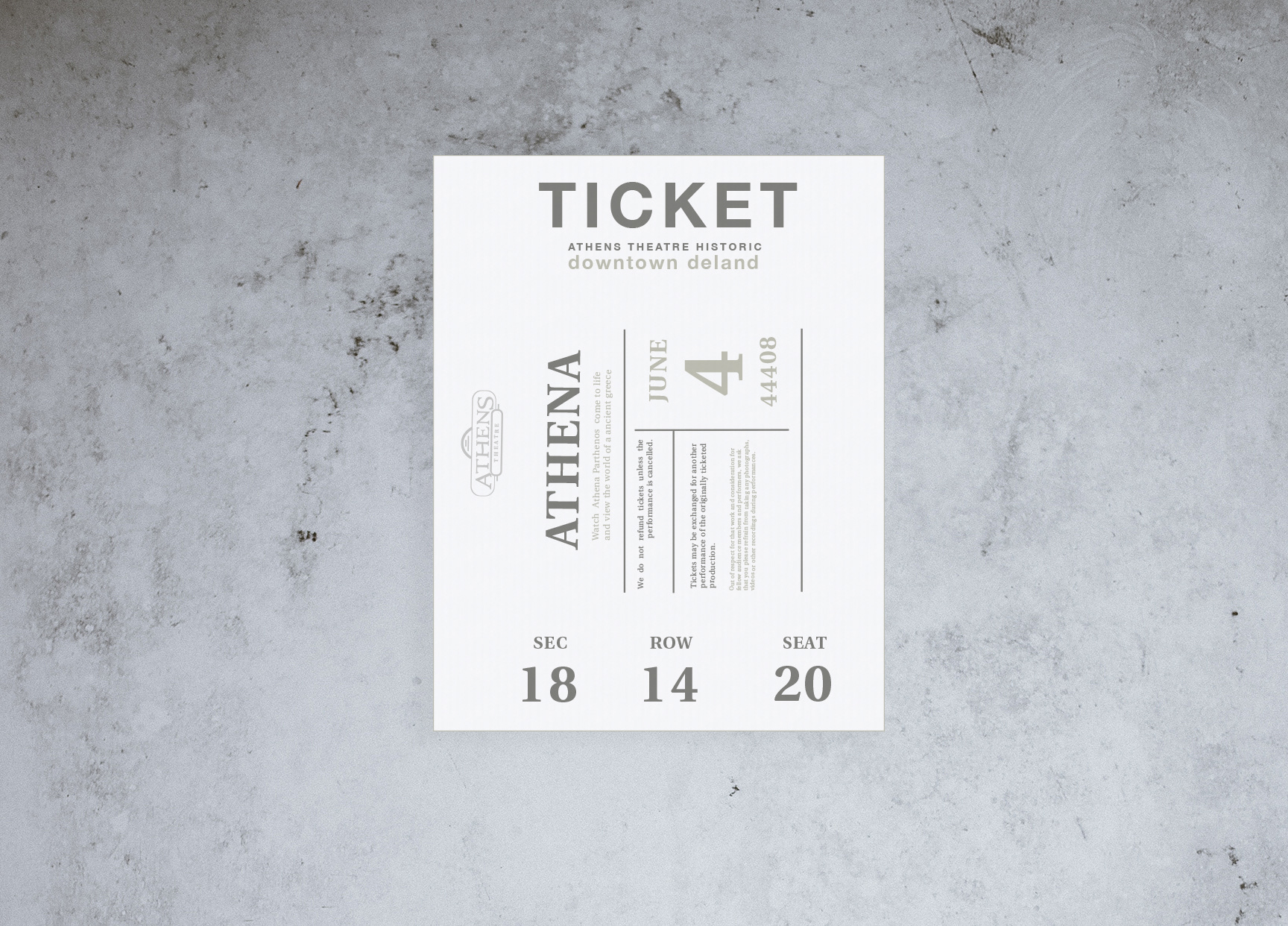
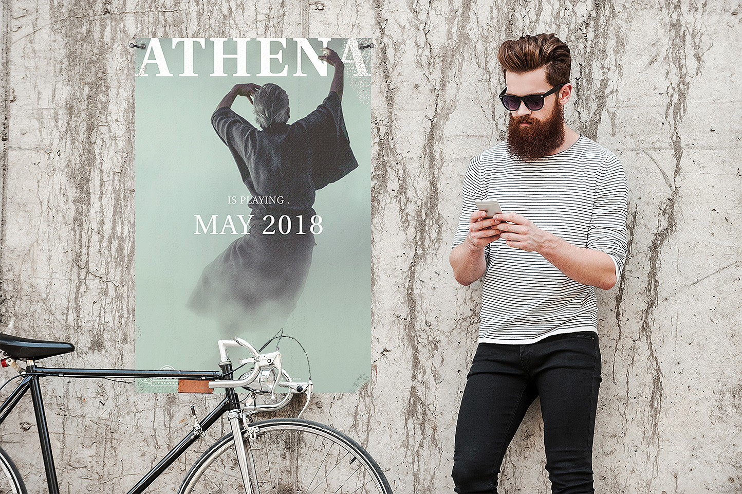
box office branding
The branding that came after pinpointing Athens’ target audience while using a persona. With some knowledge of art history,
I wanted to give Athens a classical and Hellenistic art period design, a look that dates back to ancient Greece, but still modern and relatable to the target audience.
I wanted to give Athens a classical and Hellenistic art period design, a look that dates back to ancient Greece, but still modern and relatable to the target audience.
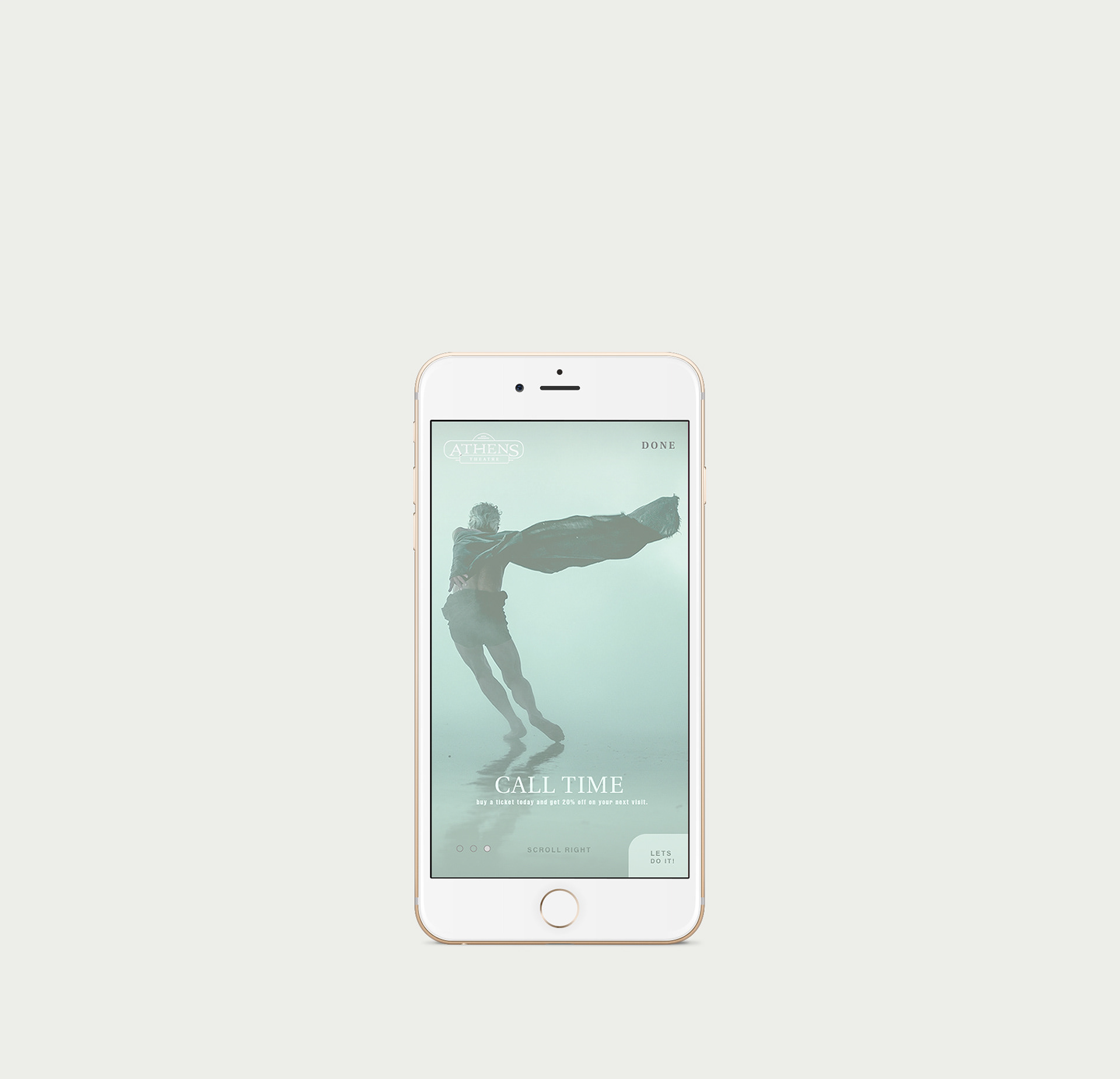
mobile landing page
merchandise